
You are viewing an archive of Victory Road.
Victory Road closed on January 8, 2018. Thank you for making us a part of your lives since 2006! Please read this thread for details if you missed it.

Administrator
10,307 posts
These were revealed a couple days ago, but I figured I'd at least start a thread for them. Pretty sweet, don't you think? I like the large "X" and "Y" in the backgrounds.
 11 – Reuniclus, Music, Yoshi648, SpikyEaredPichu96, teamplasma, JDxImpetus, LugiaDialga, Aquablast, Twiggy, BigN64, GalliumGrant
Moderator
3,268 posts
These designs are quite elegant, I like 'em~
1 – Music
Charizard
112 posts
They seem quite different then all the previous ones to me, a different feel or something o.O I'm going to need to get myself a 3DS soon.

Shaymin
2,710 posts
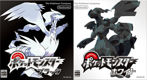
The box arts are one of my favorites, but Pokemon White 2 was pretty good as well.
I think X is better, though both of them are pretty neat, I just like how it is light colored with the X and nature behind it. I think the Y's background is interesting in of style, but the sky background is a little bland. I am being drawn towards buying X from this. ![]()

Volcarona
676 posts
I love how you can see the artwork in the background behind Yveltal and Xerneas. On the box of Pokemon X is the forest we saw Xerneas depicted in on the first trailer. And of course, behind Yveltal is the glorious open cloudy sky where Yveltal was also depicted in on the first announcement teaser trailer. The colors are not opposites of the Pokemon either, similar to BW2, the lighter colored Pokemon for X version has a light colored box while Yveltal has a darker box. I reallly like this a lot. Makes me happy that Yveltal's box is also dark, since that's the version I'm getting~ But these are pretty sleek designs for just the cover art of a box.

Kyurem
2,014 posts
They've dropped the "version" text! :O
Also, I hope these are holographic, because that would look really cool with that art.
2 – Eagles, SpikyEaredPichu96
Rayquaza
4,872 posts
I like how they put more detail in the background again especially when you compare this.
to this

3 – LugiaDialga, Music, GalliumGrant
Regigigas
742 posts
Yay! Colorful letters! Box art is neat. I like it lots.

Giratina
3,388 posts
Whoa guys, catch me when I fall. I'm in love with the box art. And I love Yveltal more.
Charizard
119 posts
Just shut up and take my money!

Charizard
117 posts
I'm starting to wonder if the covers will continue the once-used tradition of shiny-looking covers, that was seemingly absent in Black and White 1. You know, where if you shine it up in light, sometimes it has a sleek shine to it or a glittery feel?
I could see it being used either on the spaces outside the letters or the silhouettes inside.
(Don't press me on whether or not they were in Black and White 2.)

Kyurem
2,098 posts
|
Originally Posted by DiamondEdge

(Don't press me on whether or not they were in Black and White 2.)
|

Charizard
109 posts
I want both games! xD I'll be getting X first then Y soon after. ![]()
Out of all the main Pokemon games, X&Y has the best looking box art, imo. :3

Cyndaquil
20 posts
I really like this gen's box art. Much better than Black and White, and really eye-catching.