You are viewing an archive of Victory Road.
Victory Road closed on January 8, 2018. Thank you for making us a part of your lives since 2006! Please read this thread for details if you missed it.
| Thicker, sub-pixel (So deep, it's like it's there!) | 1 | 50.00% | |
| Normal, sub-pixel (Looking just right!) | 1 | 50.00% | |
| Lighter, sub-pixel (Super-sharp text!) | 0 | 0.00% | |
| Grayscale (I hate color fringing, but blurry text?) | 0 | 0.00% | |
| Disabled (I love jaggies!) | 0 | 0.00% |

Kyurem
2,098 posts
You might want to tweak around a bit with the font rendering settings for optimal clarity. I noticed that things were a bit too muddy in IE9 (due to the way it renders text, same thing also happens with Firefox), so I decided to do some ClearType setting tweaking.
The following applies to Windows 7 and 8.
Windows XP and Vista users should head to the ClearType Tuner hosted on Microsoft Typography.
Users of other operating systems should have a way to adjust sub-pixel anti-aliasing - instructions vary.
Note that the instructions include large images.
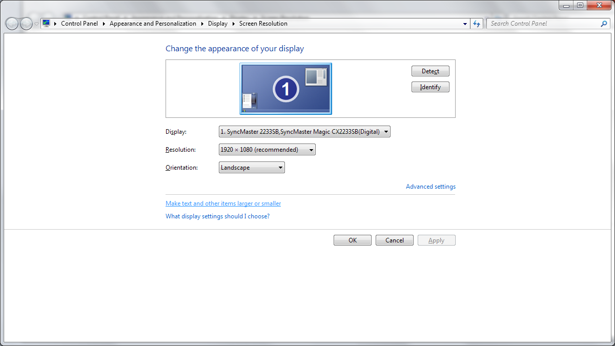
1. Right-click on any empty part of your desktop, then click Screen resolution.
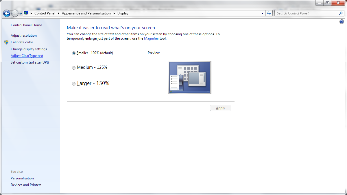
2. Click Make text and other items larger or smaller.
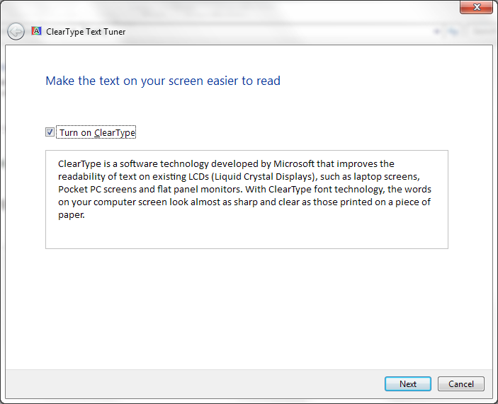
3. Click Adjust ClearType text.
4. Follow the on-screen instructions. Determine what looks the sharpest and cleanest in every step, and click them to set them as your choice.

Zoroark
251 posts
Thickest possible CT. On both LCD and LED monitors I found text to look much more smooth and pleasant to read.